今天为大家分享的是刚刚完工的楷林学院项目。楷林,是写字楼品牌的领导者,也是本次我们的甲方。
本次,题为“为楷林而设计”,具体来说,是“为楷林精神而设计”。
Today I would like to share with you the newly completed Kai Lin College project.Kai Lin, the leader of the office building brand, is also our Party A this time.
This time, the title is "Design for Kai Lin", specifically, it is "Design for Kai Lin Spirit".
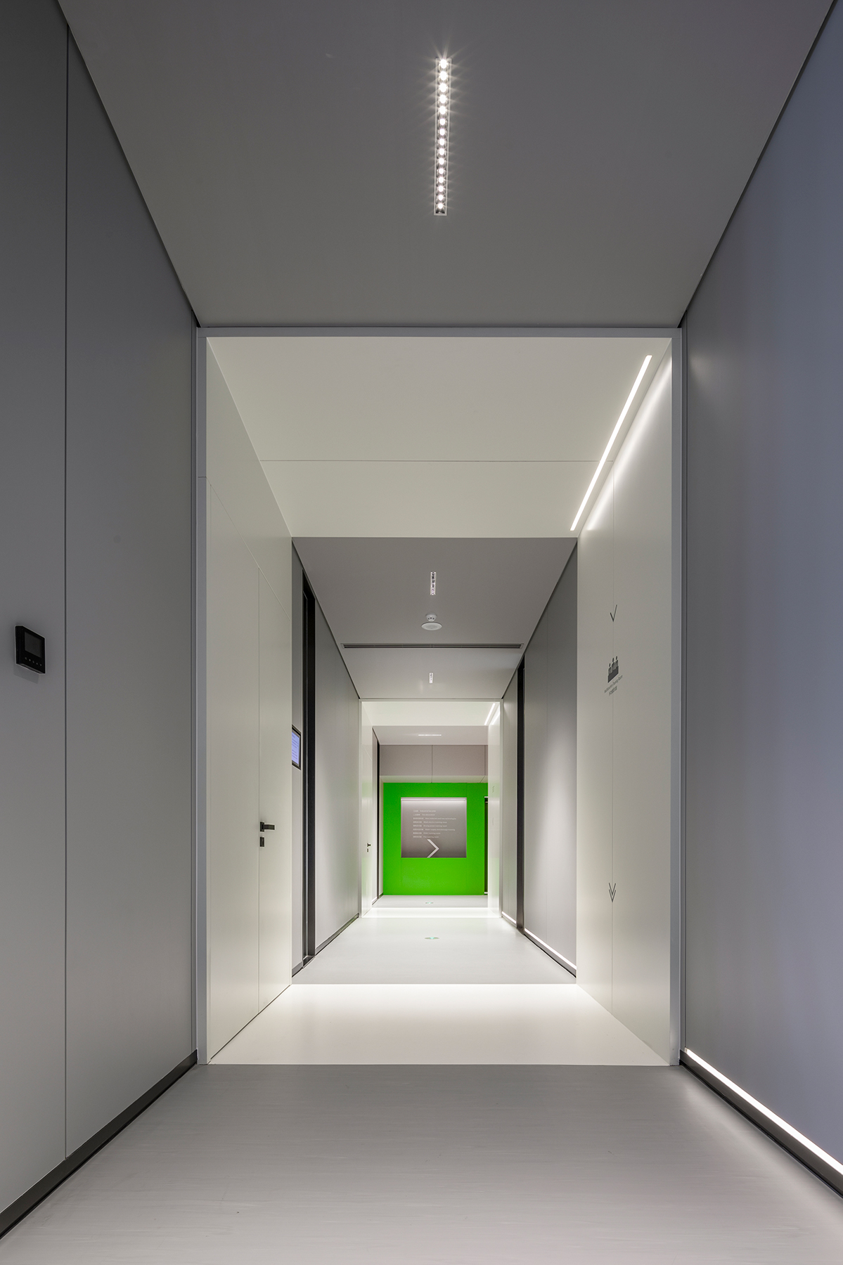
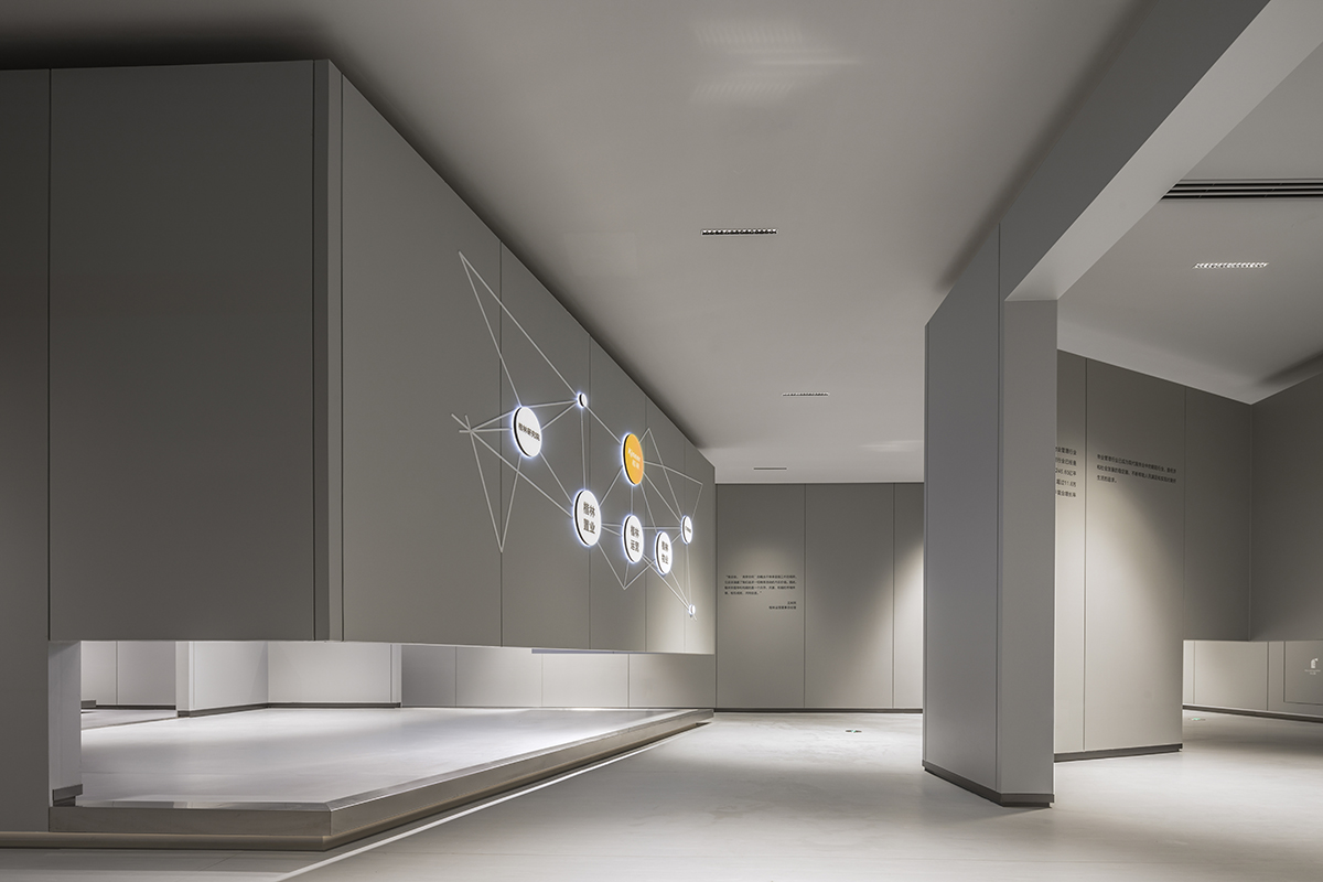
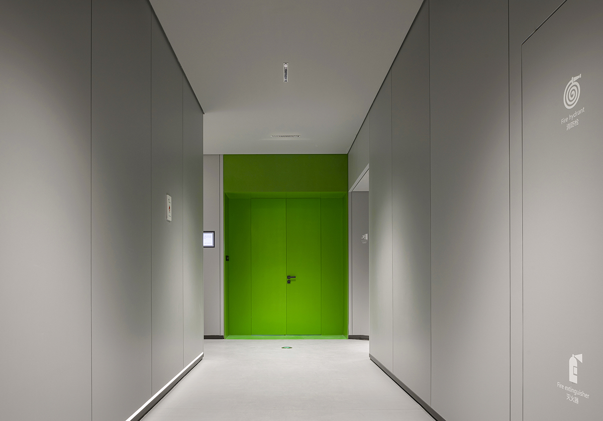
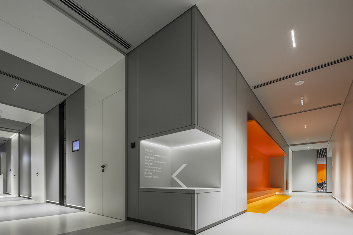
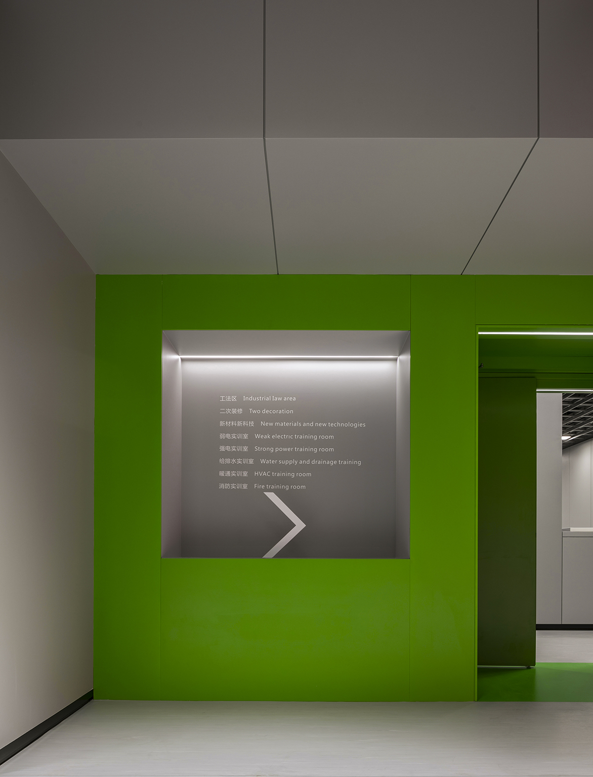
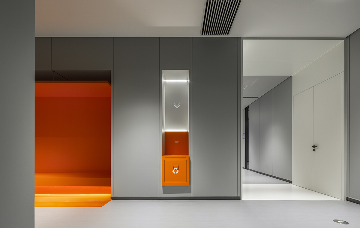
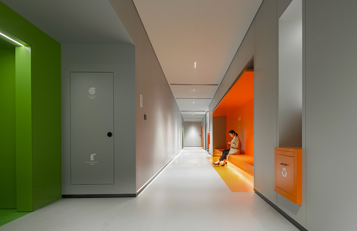
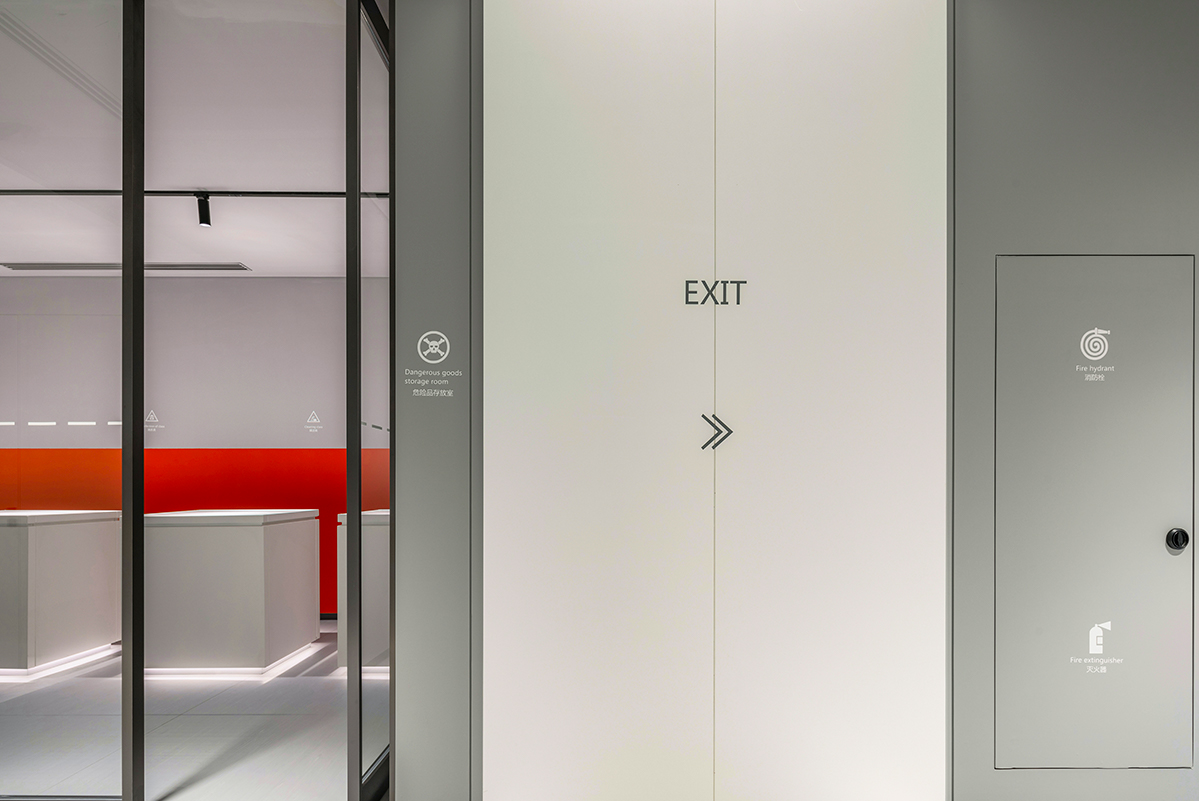
整个空间我们采用了蓝色、白色、橙色、灰色、绿色五种颜色。
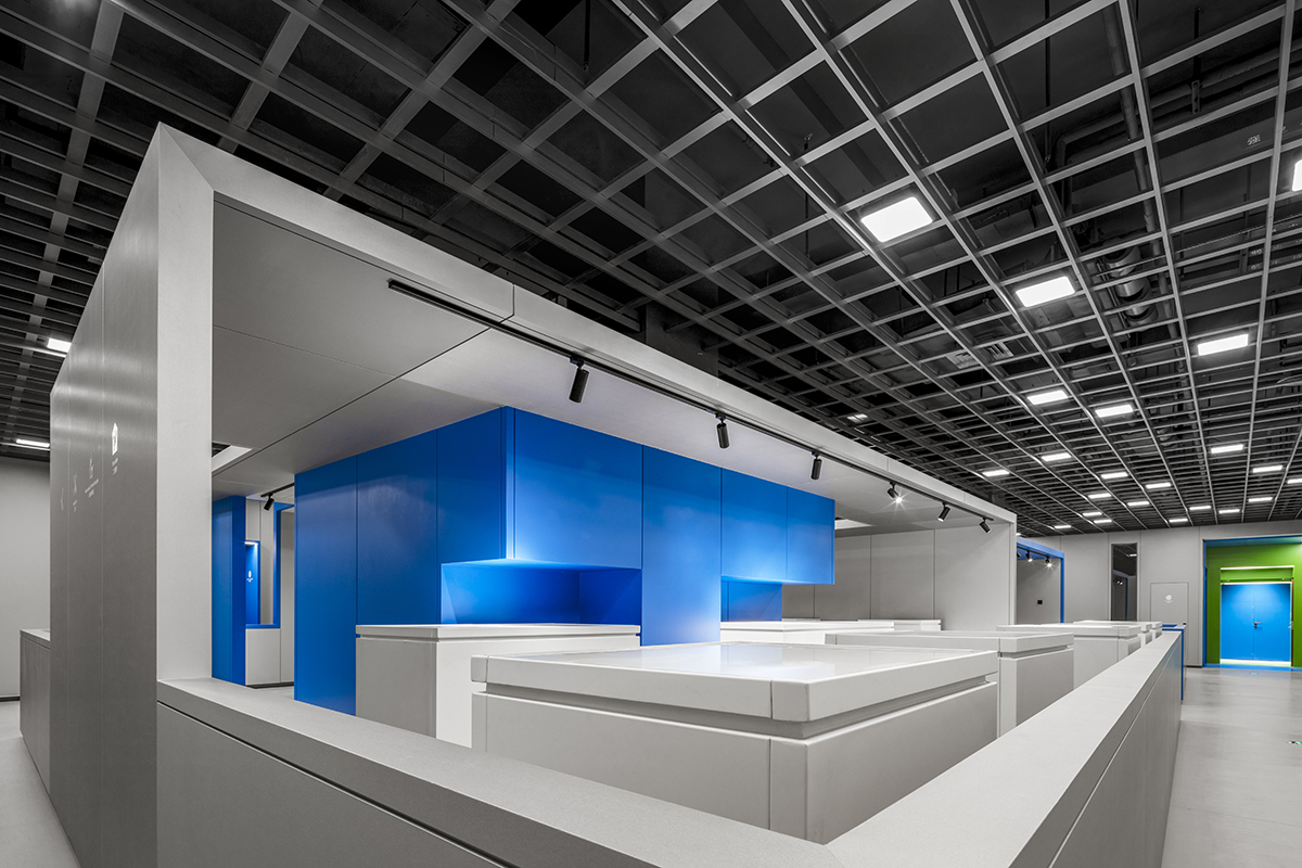
蓝色代表科技;绿色代表安全出口,逃生类指示;白色代表企业纯粹至极的品质追求;橙色代表感性的创意建设互动;灰色则是整个空间的基调。
We use blue, white, orange, gray and green in the whole space.Blue is technology;
Green represents the safety exit, escape instructions;White represents the company's pure pursuit of quality;Orange represents the interaction of perceptual creative construction;
Gray is the fundamental key of whole space.





阅读:19


